
Catamount Trading / Brand identity & digital design
Bringing adventure
to trading.
A pioneering identity for a new
generation of trading talent.
02 / Overview
A trading brand with
a pioneering spirit.
Catamount wanted to attract people who think differently. The identity brings the precision of quantitative trading together with the freedom and curiosity of exploration.
The challenge
Give a new quant trading firm a distinctive presence, with a brand that speaks to technologists, researchers and traders drawn to a supportive, ambitious culture.
The creative idea
Bring adventure to trading. Topographic contours, energetic colour and technical typography connect the freedom to explore with the precision of the discipline.
My role
I was responsible for the art direction and design at SLIK, shaping the identity and its expression across the website, brand guidelines and supporting applications.
03 / The identity system
Technical precision.
Exploratory energy.
A bold wordmark gives the brand an immediate signature. Contour lines create a flexible graphic language that moves between open landscapes, digital surfaces and information design.
Science Blue.
Bright Green.
The two primary colours carry the brand. Yellow, pink and purple extend the system into more expressive applications.
A technical voice
with a human rhythm.
Monospaced MD IO headlines establish the technical character. Karla supports longer reading, while italic emphasis brings movement into key phrases.
One line.
Many expressions.
Contours suggest terrain and discovery. Charts and diagrams give the same visual world a practical role in communicating information.
Hero typeface
Functional typeface
- Primary colour #0236DC
- Primary colour #6DFC22
- Secondary colour #9100B2
- Secondary colour #FF4DA2
- Secondary colour #FFDB00
04 / The brand in motion
An identity
made to move.
The website brings the system into motion: drifting contours, changing headlines and animated graphics create a digital expression of the brand’s pioneering character.
Movement as a material.
The contour animation gives the graphic system a quiet, continuous movement. It works as an atmospheric layer behind the website’s sharper typography and information.
The cover carries that same contour language into a seamless vector loop.
05 / Across the brand
A world beyond
the wordmark.
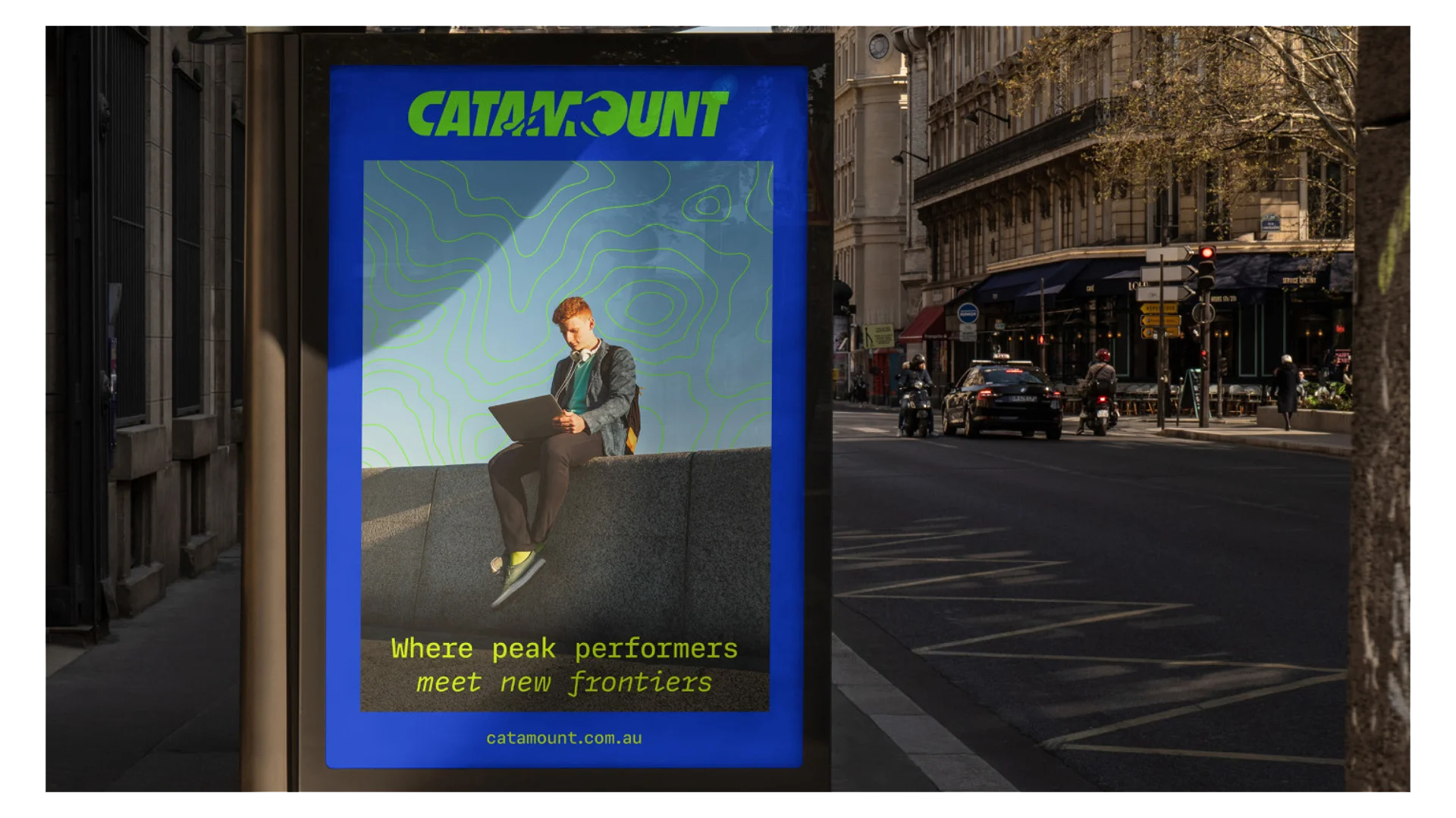
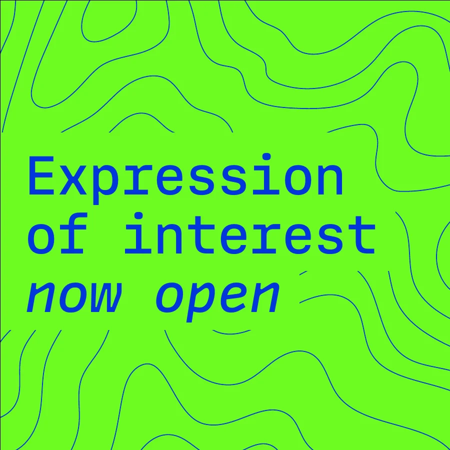
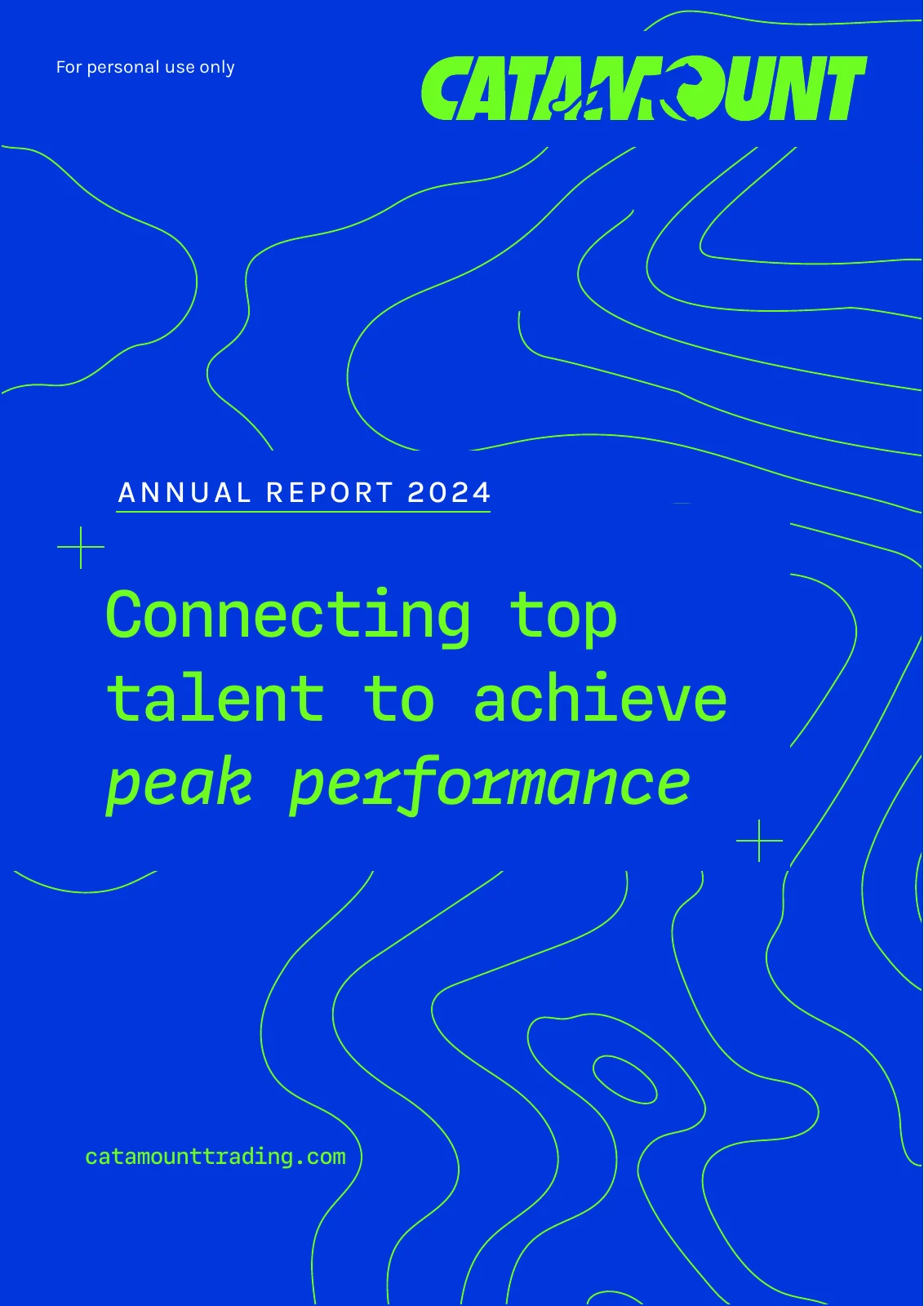
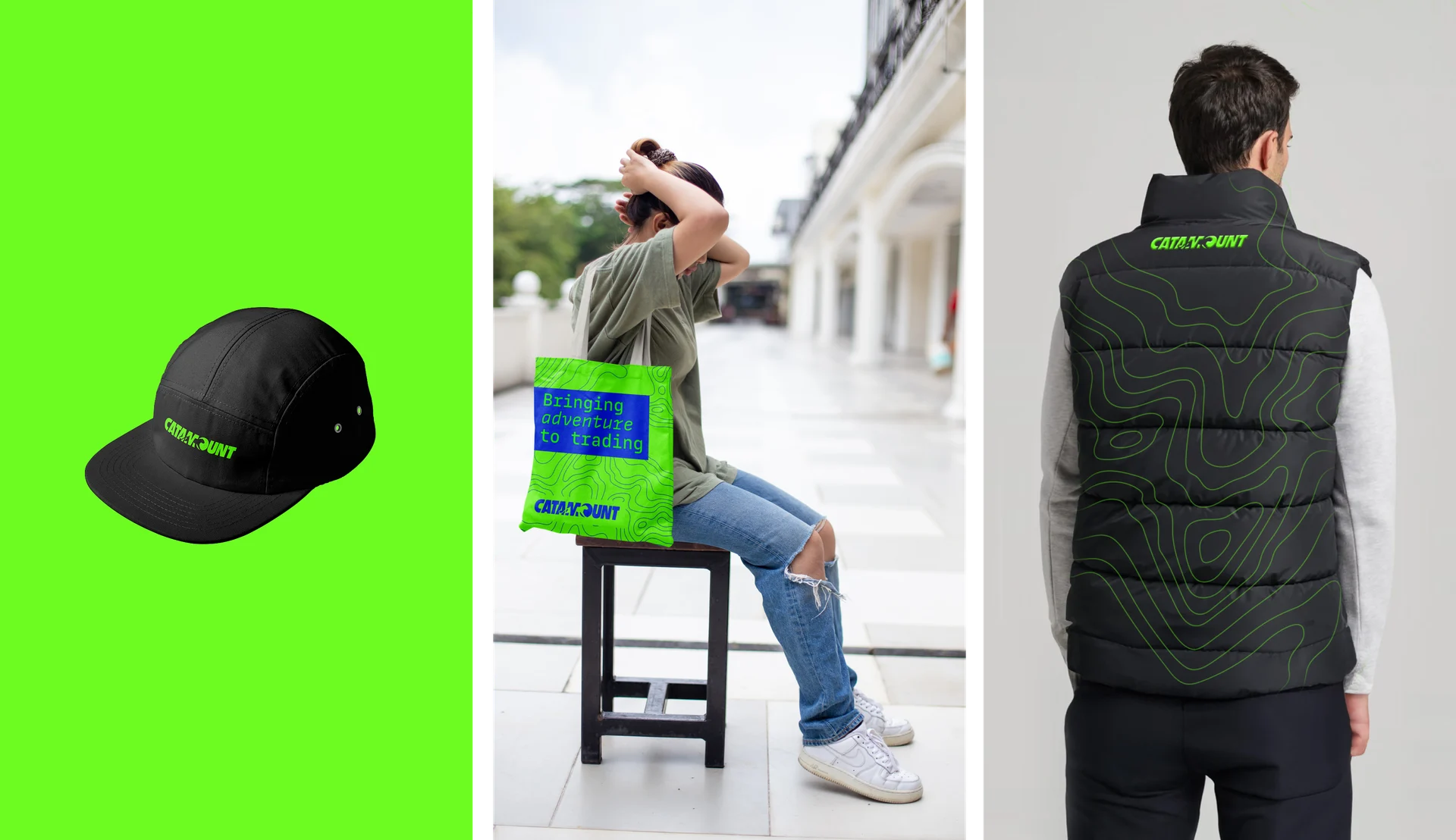
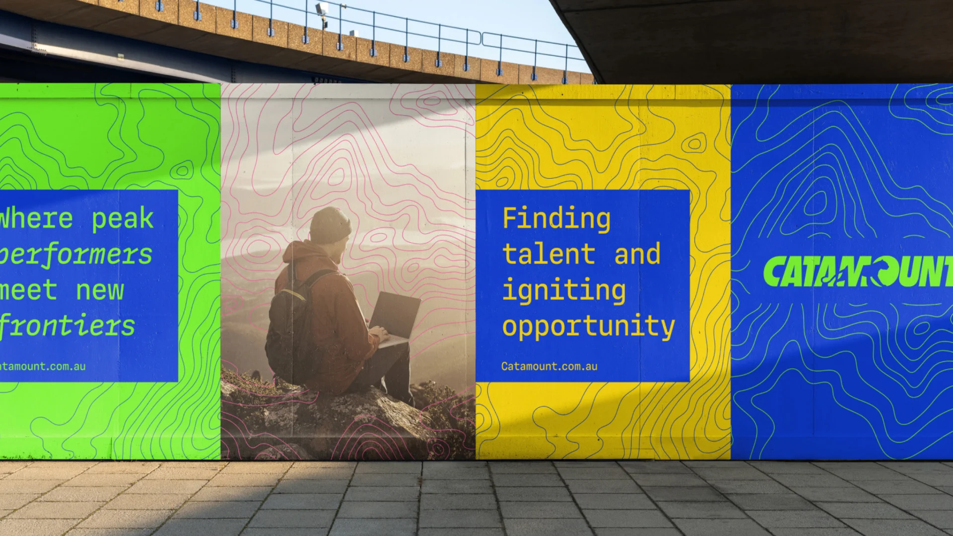
The same ingredients carry through recruitment, social content, reports and merchandise. The system can be expressive at a distance and structured when the information needs more detail.

From atmosphere
to information.
Technical type and a disciplined palette give reports and data graphics a clear connection to the more expressive brand applications.
Dot matrix
Layered proportions
Trend line
Change statistic
Bubble comparison
06 / The complete picture
Built around
the freedom to perform.
A connected identity across the brand and its digital presence. The combination of exploration and precision gives Catamount a recognisable way to introduce itself and the people it hopes to attract.