


Darrell Lea
A classic
with a twist.
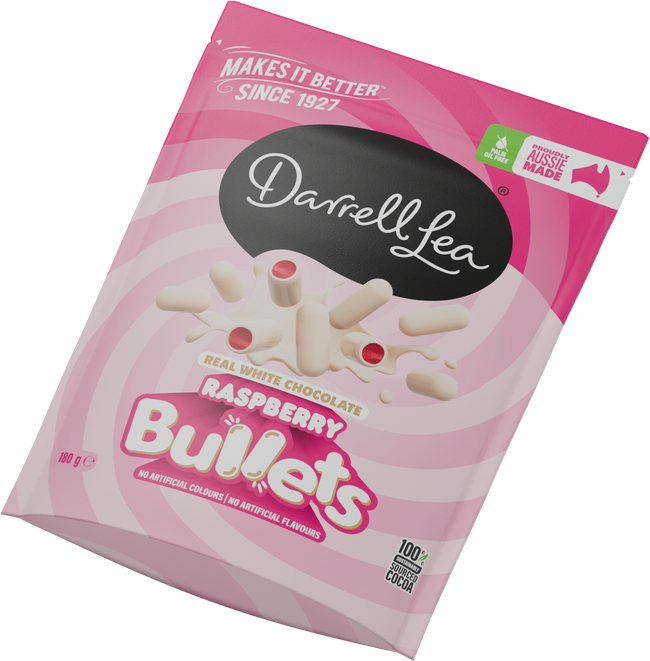
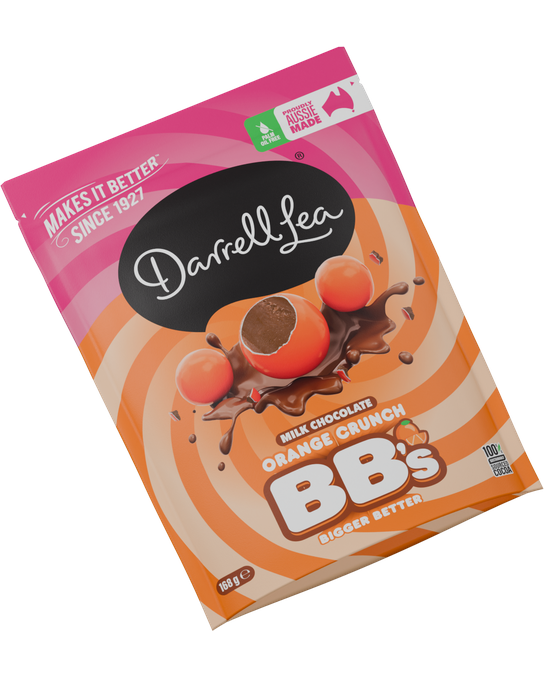
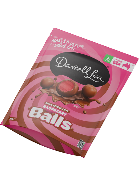
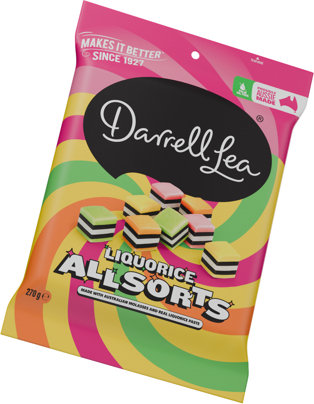
At SLIK, I led the redesign of Darrell Lea’s packaging. The brief was to make the family recognisable across the aisle and each favourite easy to find up close.
The transformation
It started
with a stripe.
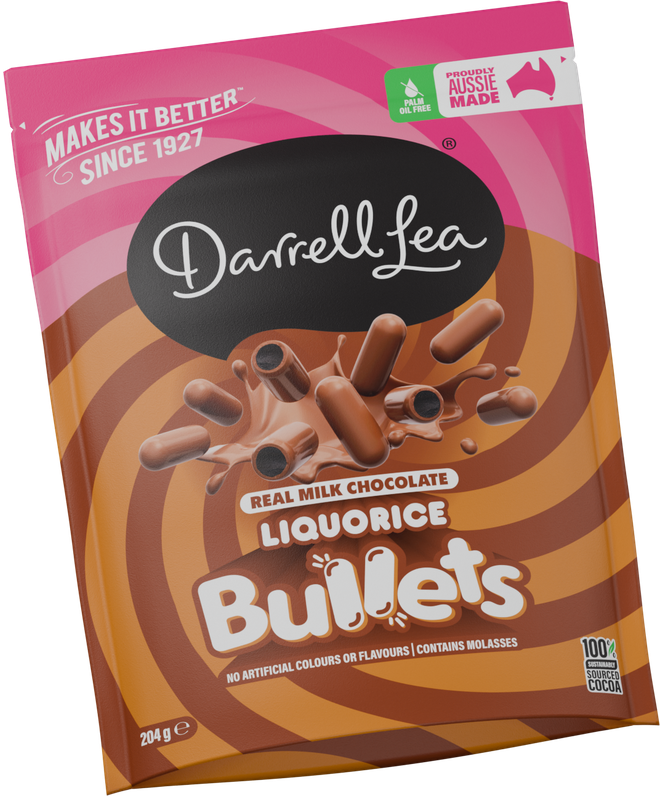
The original Bullets pouch gave me a starting point. I took its diagonal stripe and curved it around the cut-open liquorice centre. The stripe still belonged to Darrell Lea. The centre told you it was a Bullet.
One idea.
Every detail.
The swirl draws your eye to the liquorice inside the chocolate shell. Above it sits the Darrell Lea signature. Below it, the gold and chocolate bands frame the Bullets name.
One twist.
Many personalities.
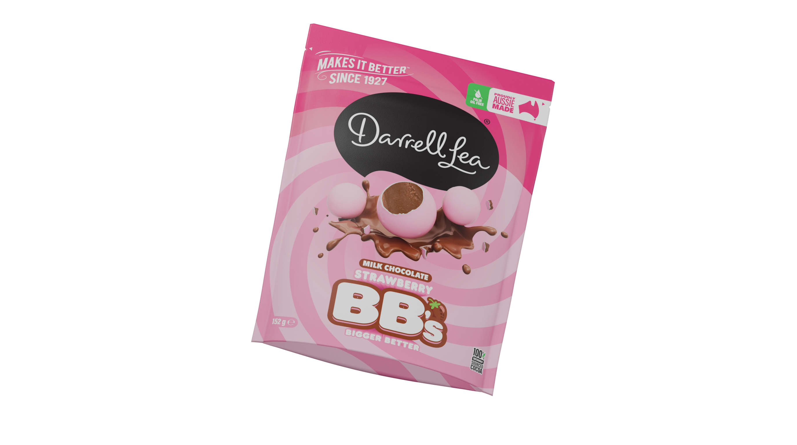
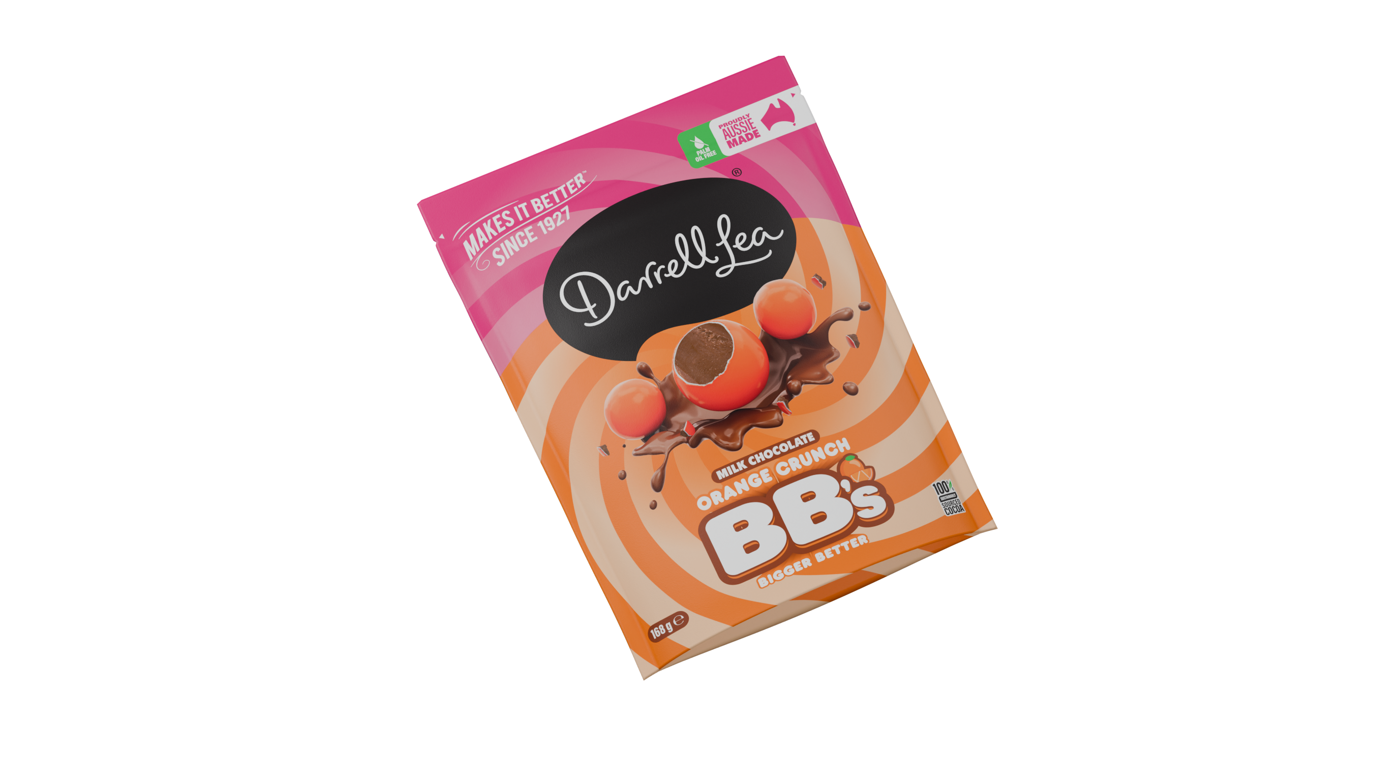
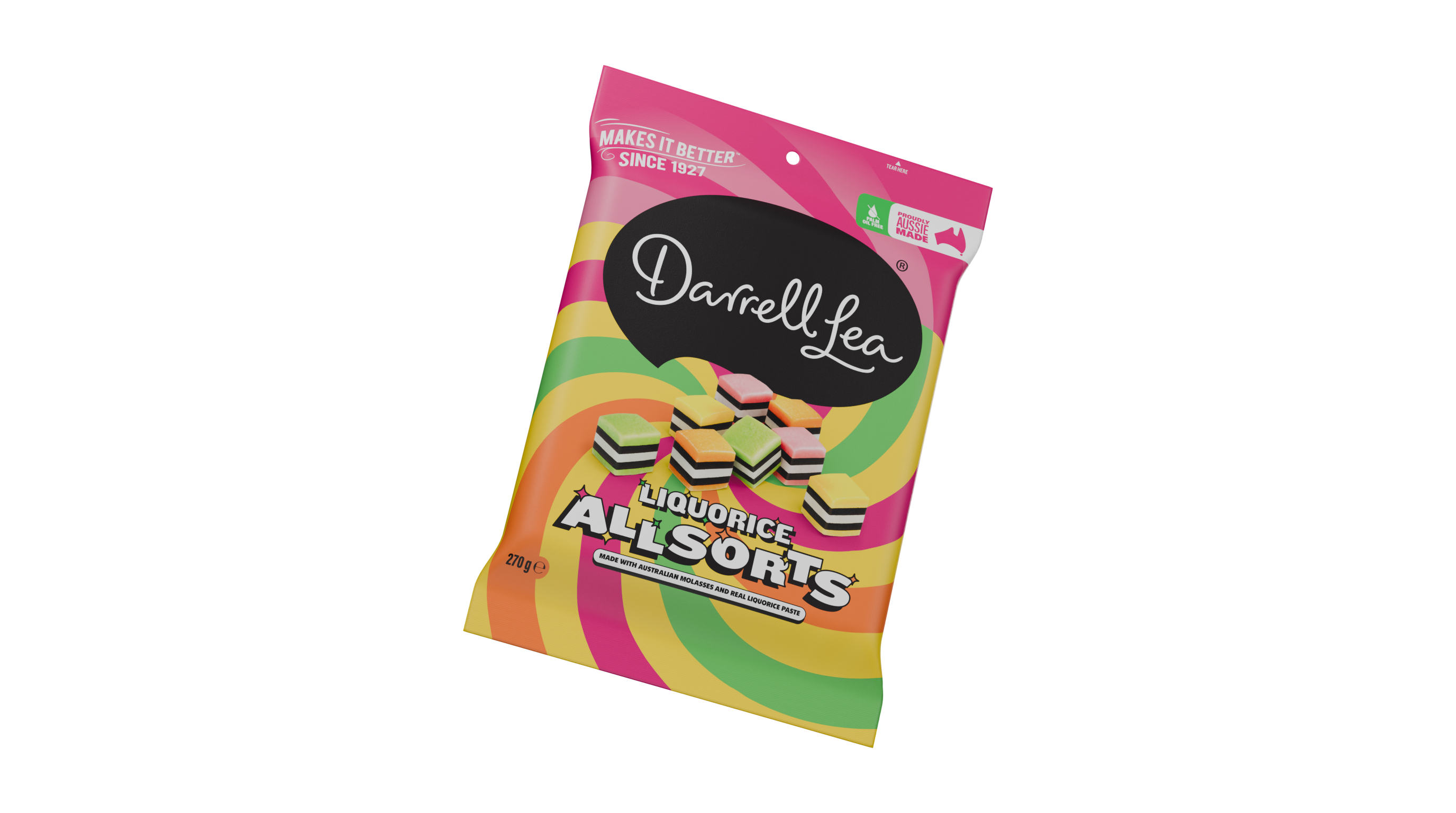
On Liquorice Bullets, gold and chocolate bands curl around the cut liquorice centre. The pink top and black Darrell Lea signature carry across the range.
- Client
- Darrell Lea
- Agency
- SLIK
- Role
- Art direction & design
- Disciplines
- Packaging
Range architecture
From stripe to swirl
Drag the pack, use the slider, or play the transformation.
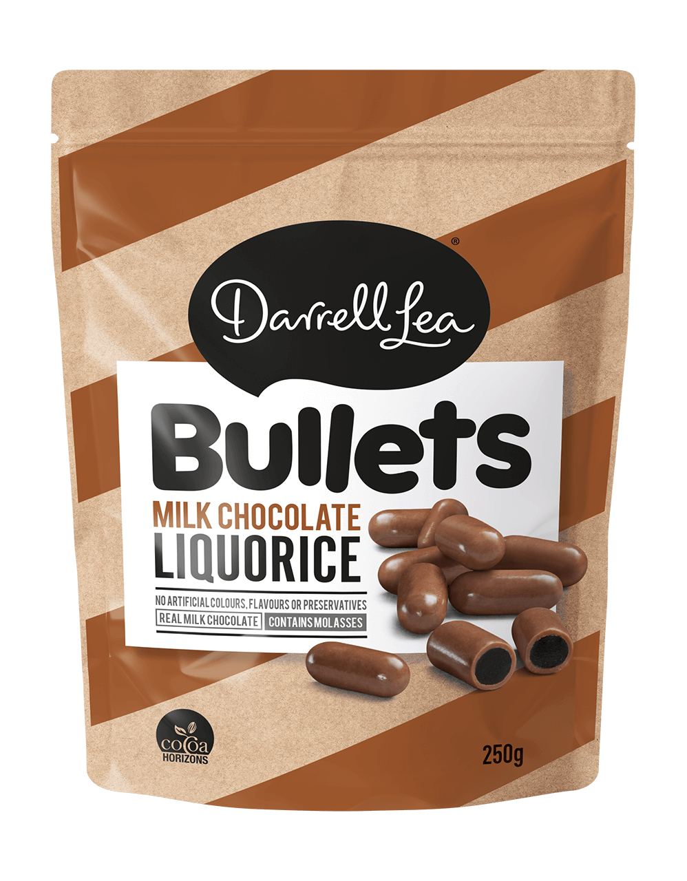
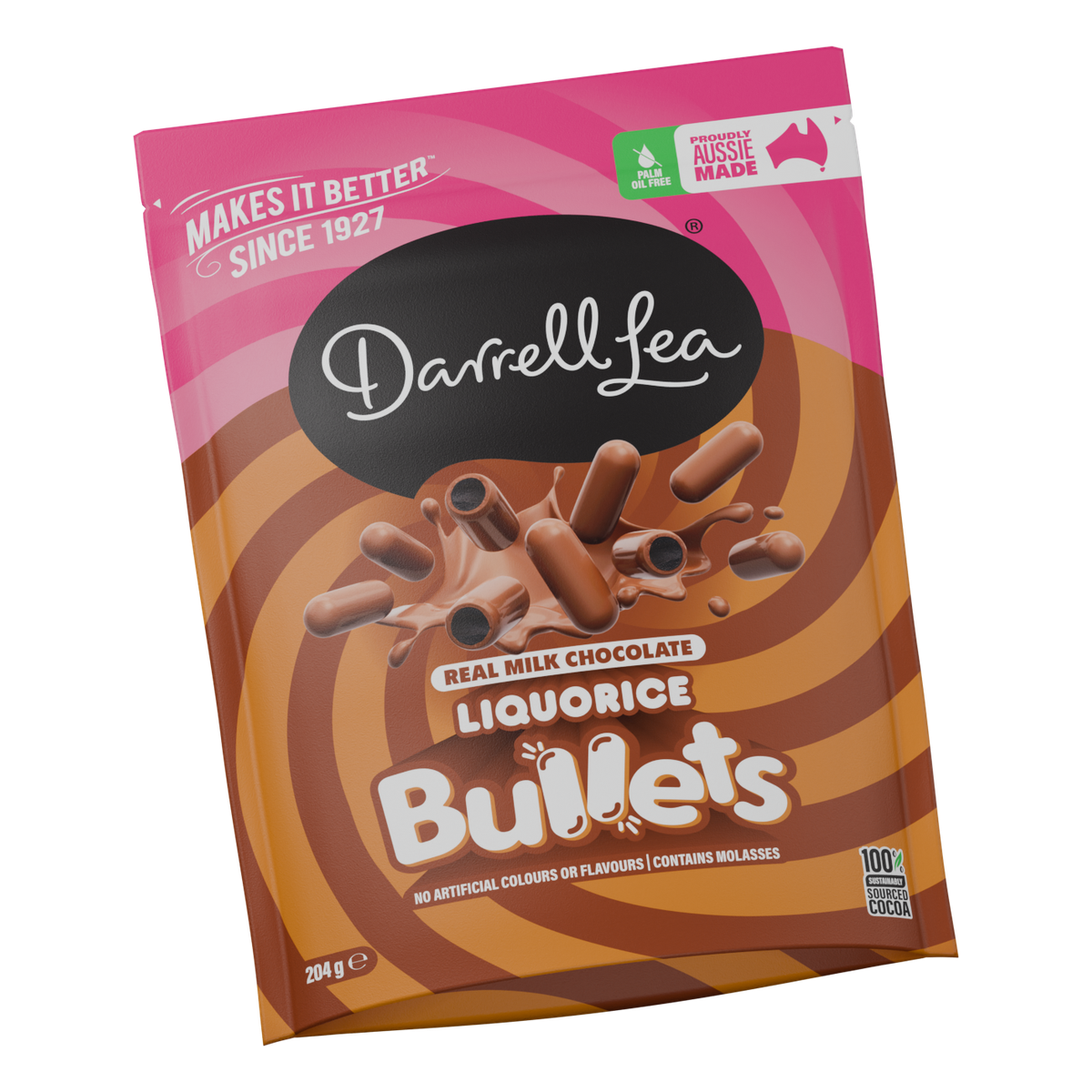
Drag the pack, use the slider, or play the before and after.
Swirl
Follow a gold band in from the edge of the pouch. It leads back to the centre of a cut-open Bullet.
Product styling
A cut Bullet shows the dark liquorice inside its milk chocolate shell. The whole pieces around it show the shape you’ll find in the bag.
Flavour hierarchy
Bullets is the largest word on the pack. Just above it, “Liquorice” and “Real milk chocolate” tell you what’s inside.
Heritage
The white Darrell Lea signature keeps its black oval. Across the pink top, “Makes It Better Since 1927” sits opposite the Aussie Made mark.
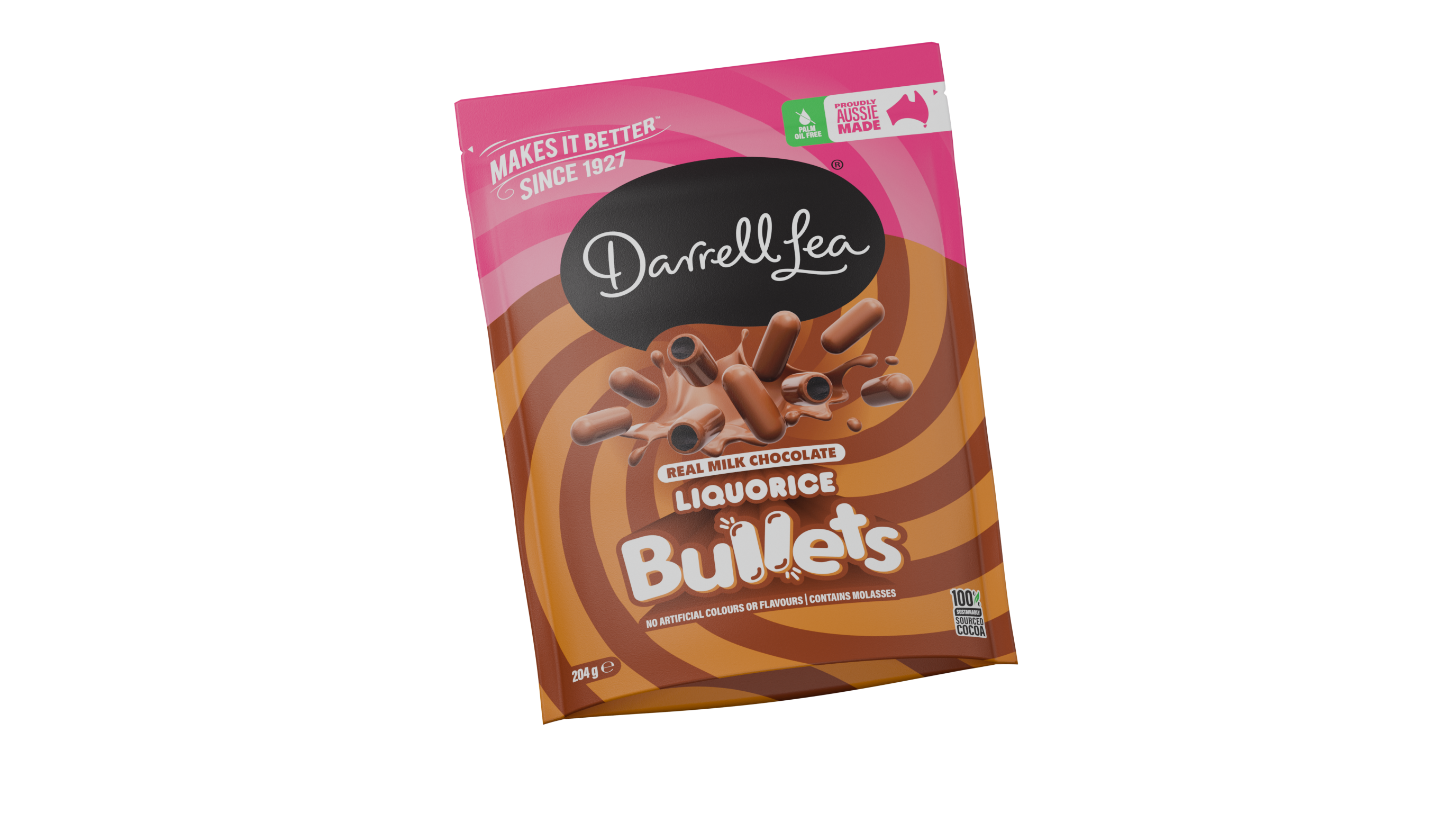
Explore the family
The complete picture
One family.
Full of character.
